Reef Life Foundation
Overview
- Timeline: 4 weeks (160 hours)
- Team Size: 6
- Role: Lead Designer & Developer, Back up Researcher
- Tools: Figma, VSCode, GitHub, ChatGPT
Background
In the ocean coral reefs provide crucial ecosystem services, supporting biodiversity and coastal communities. However, rising ocean temperatures due to climate change are causing coral bleaching, leading to mass coral deaths. A recent study by the Global Coral Reef Monitoring Network revealed that 14% of the world's coral reefs have already been lost, and up to 90% could disappear by 2050 if current warming trends continue. Reef Life Foundation aims to develop and implement innovative solutions to protect and restore coral reefs, such as coral reef restoration techniques, sustainable fishing practices, and reducing pollution, all crucial steps in mitigating the effects of climate change.
The Problem
The current Reef Life Foundation website presents several challenges that hinder user engagement and obscure critical information. A cluttered layout and outdated design creates a visually unappealing and confusing user experience. This can lead to visitors quickly becoming overwhelmed and leaving the site without learning more about the cause and considering a donation. A lack of clear educational content and a convoluted donation process can discourage potential donors.
Project Goals
Redesign a website that could significantly enhance the user experience by establishing trust and credibility thus increasing donations.
Empathize
Overview
- Approach and Goals
- User Interviews
- User Survey
- Competitive Analysis
Research Approach
1. First, we want to conduct interviews so we can determine what is most important to users when it comes to donating to a NPO like The Reef Life Foundation.
2. Then we wanted to quantify our findings so we did a survey with a group of different users to support our interview findings.
3. Using our finding from the interviews and survey, we were able to determine what was most important to users when we conducted our competitive analysis to determine what the competition is doing.
Research Goals
Uncover what motivates users to donate to NPOs like the Reef Life Foundation and what might cause them to hesitate when they visit their website.
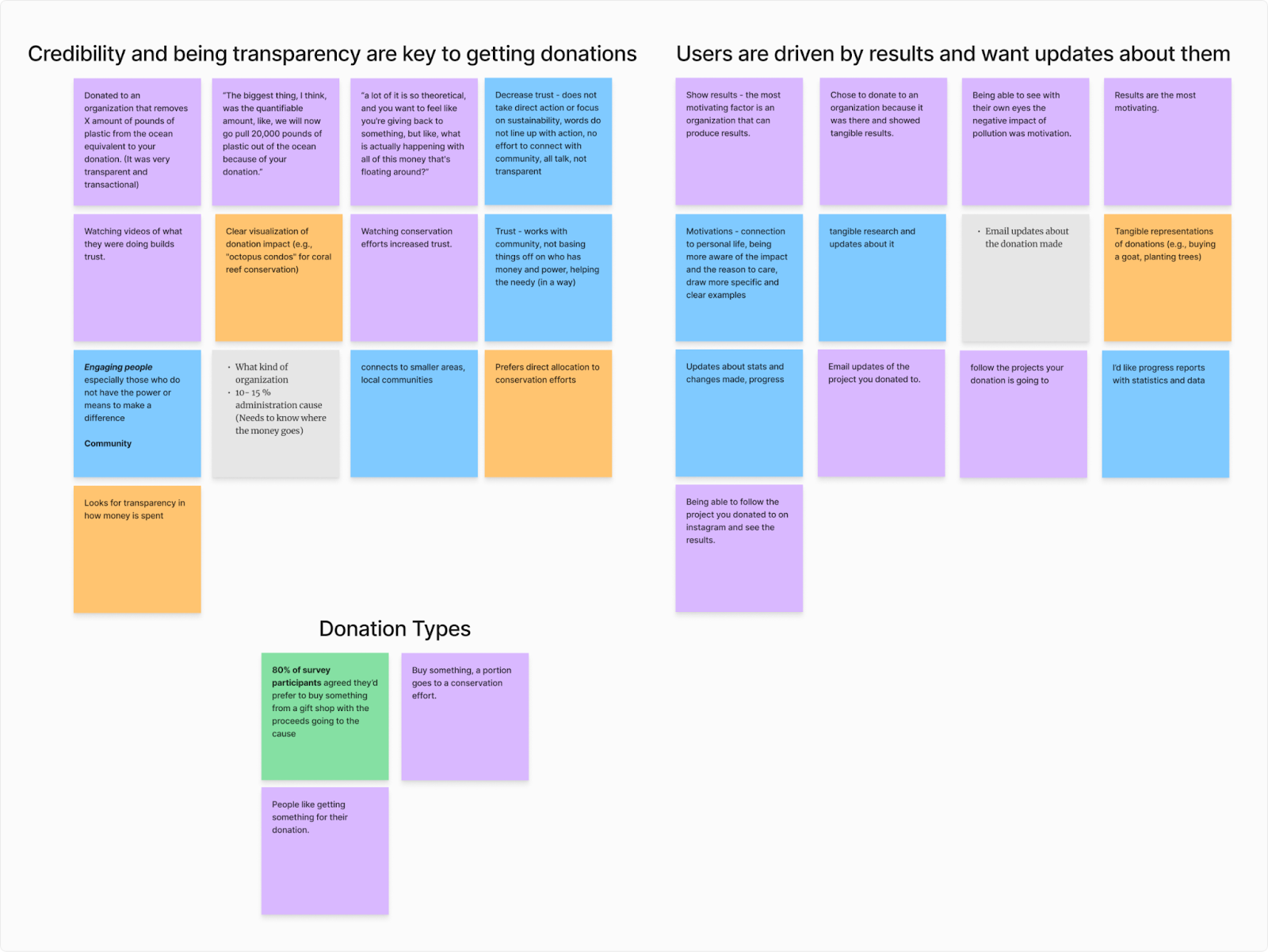
User Interviews Findings
The team conducted a total of 4 interviews with users who are passionate about conservation. Some of the main themes we found include;
1. Users want to see and feel the impact of their donations.
2. A lack of transparency and unclear goals will deter someone from donating to an organization.
3. Users want updates about the progress being made with their donation.
User Survey Results
Our survey had 26 participants who have donated to ocean conservation in the past.
1. 24 of the 26 stated that transparency and project updates on how their money is being used is the most important thing to them when it comes to picking an orgination to donate to.
2. 81% of particpants said they'd prefer to donate by purchasing merchendise where the proceeds go to the cause. Whille 50% said they also like direct donation options.
3. 65% of particpants stated that they donated because they had a desire to make a positive impact.
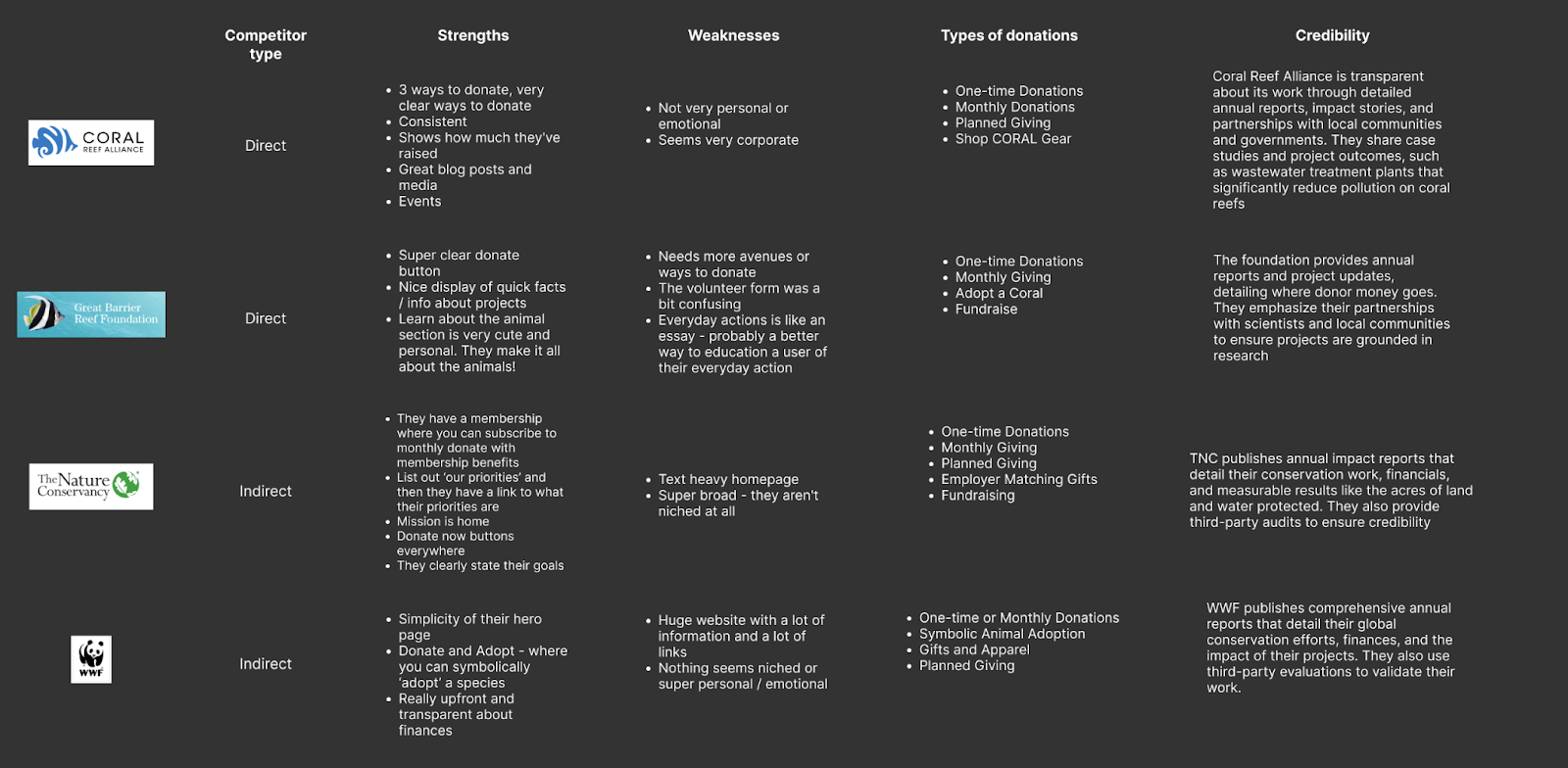
Competitive Analysis
Define
Overview
- Affinity Map
- User Persona
- Insight Statement
- Problem Statement
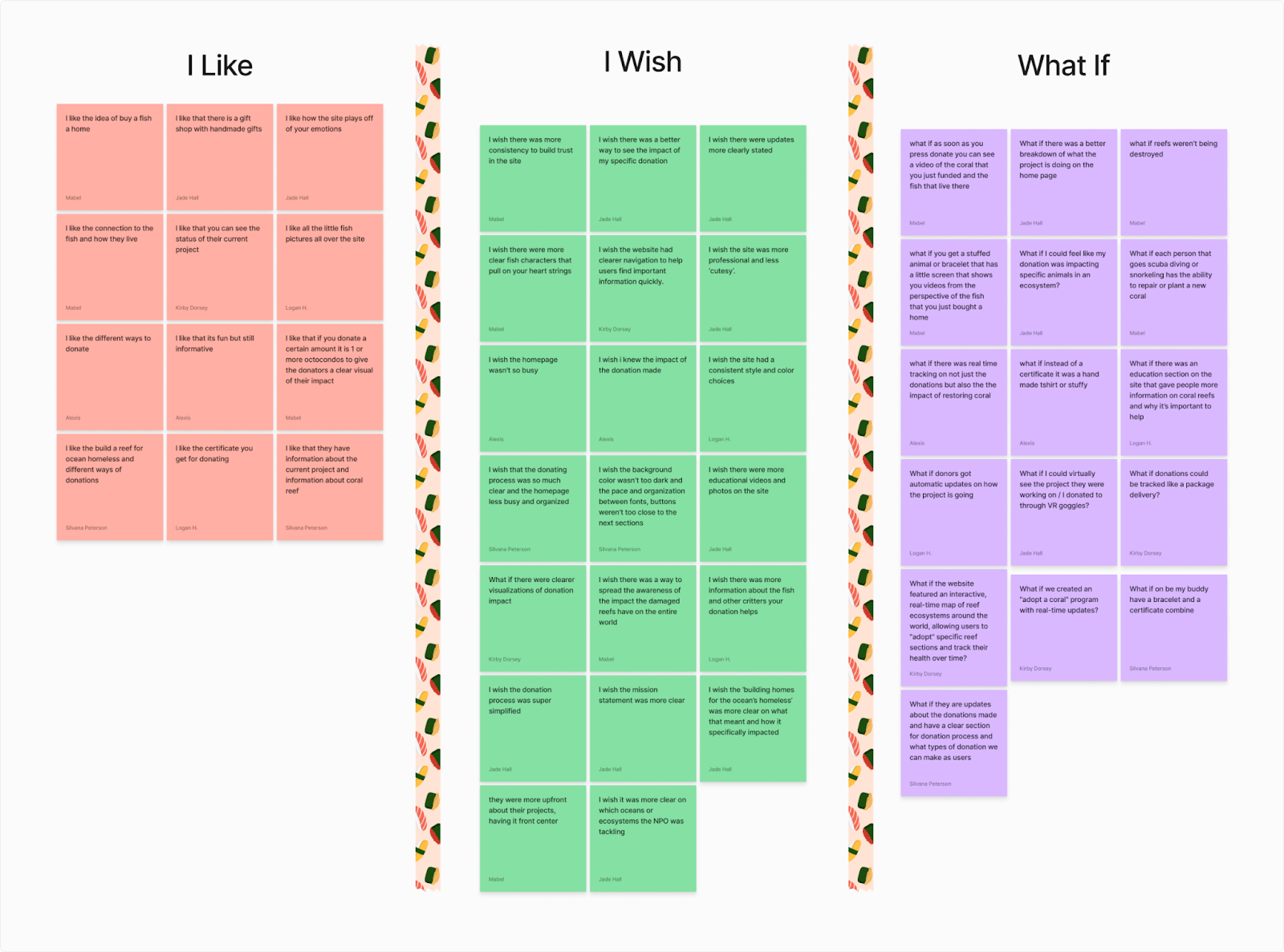
Affinity Map
We identified 3 themes crucial to our redesign.
User Persona
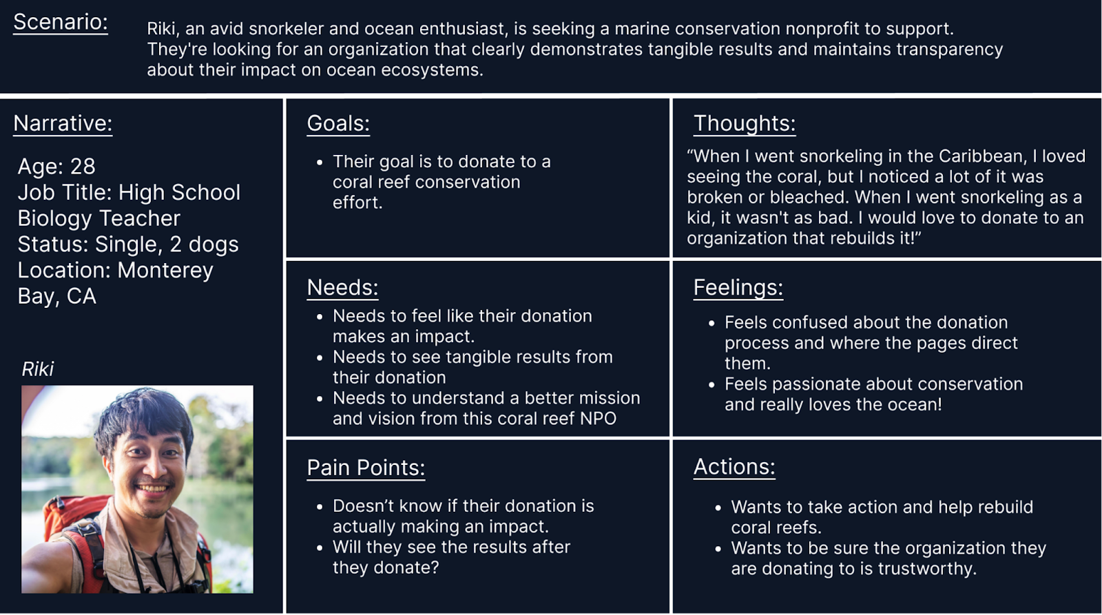
User Insight Statement
Donor’s need to see the immediate, tangible results of their contributions because they crave an emotional connection to the impact they're making
Problem Statement
We believe that sharing the impact of donations with ocean enthusiasts will help them feel that they are making a meaningful difference in ocean conservation efforts.
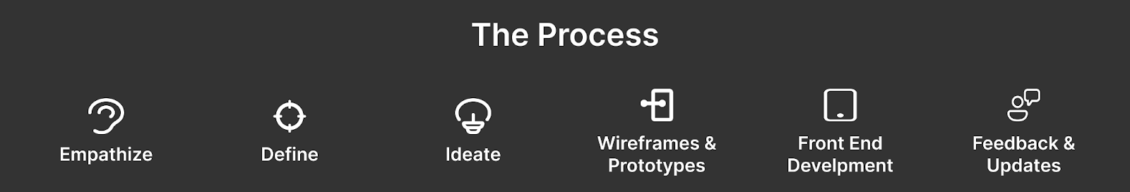
Ideate
Overview
- How Might We...
- I Like, I wish, What If?
- Prioritization Matrix
- Jounrey Map
- Site Map
- User Flow
How Might We
...Redesign the website to clearly showcase the tangible impact of donations, providing users with transparent, real-time updates on ocean conservation projects?
I like, I wish, What if?
Prioritization Matrix
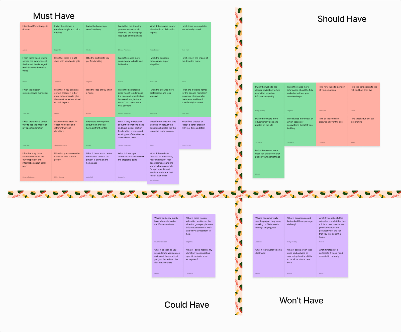
4 Key Redesign Features
1. Impactful information on the mission of the NPO
2. Easy donation process
3. Clean and consistent design
4. Clearly showing results or impact of the project
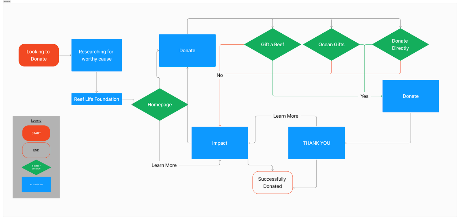
We felt the redesign must have a few features which include different avenues to donate easily, a site that builds more trust, but overall we learned from our research that we must clearly show how a user’s donation would make an impact. How does a user know their money is going to good use? How can they stay up-to-date on the impact of the donation?
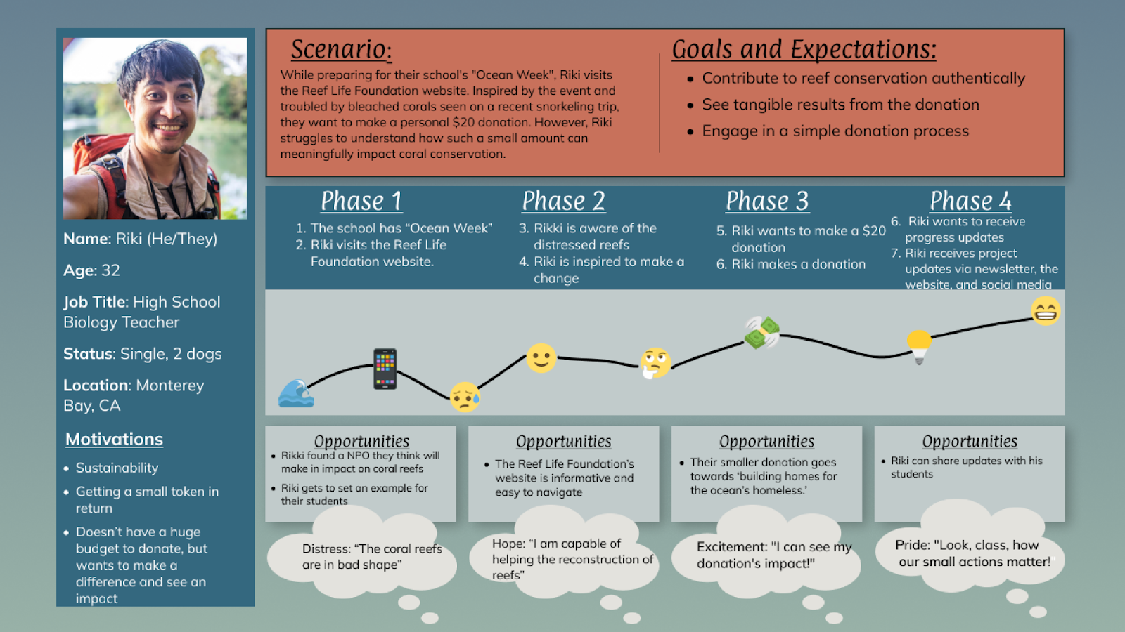
Jounrey Map
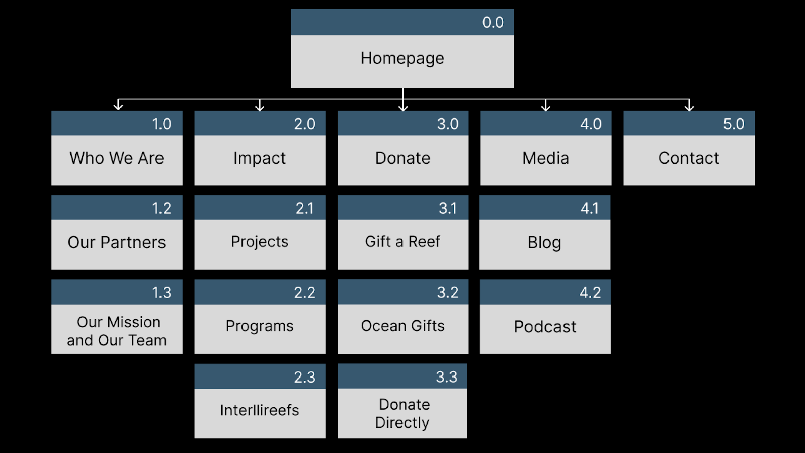
Original Site Map
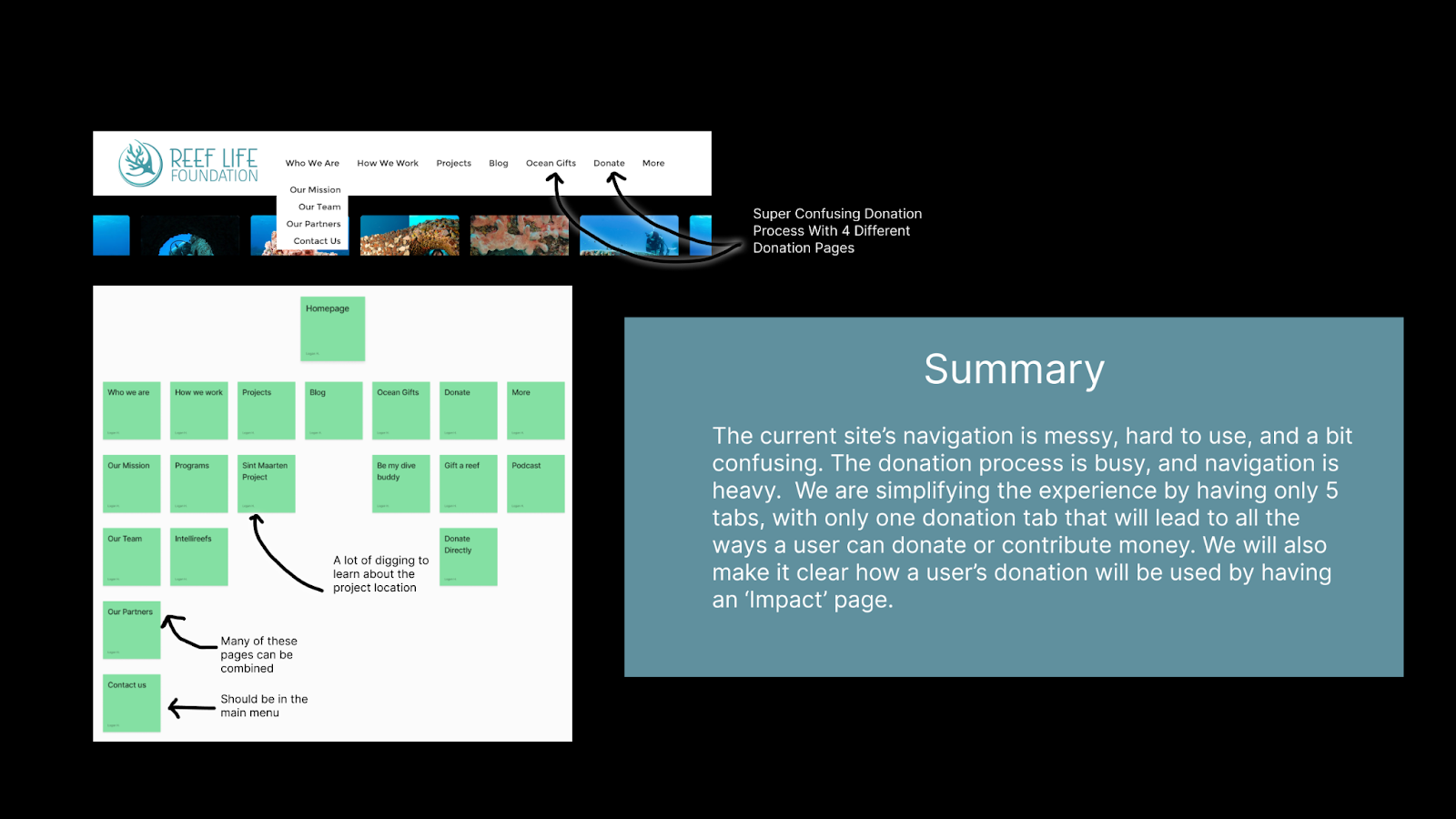
Redesigned Site Map
User Flow
Wireframes and Protoypes
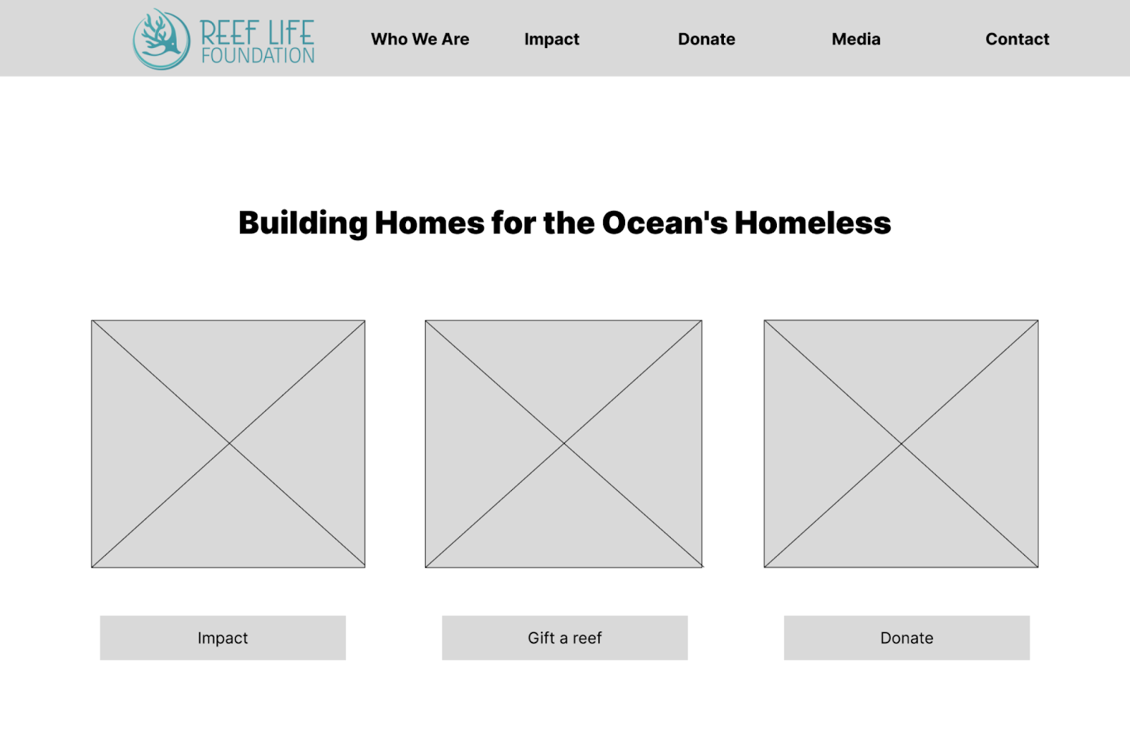
Low Fidelity
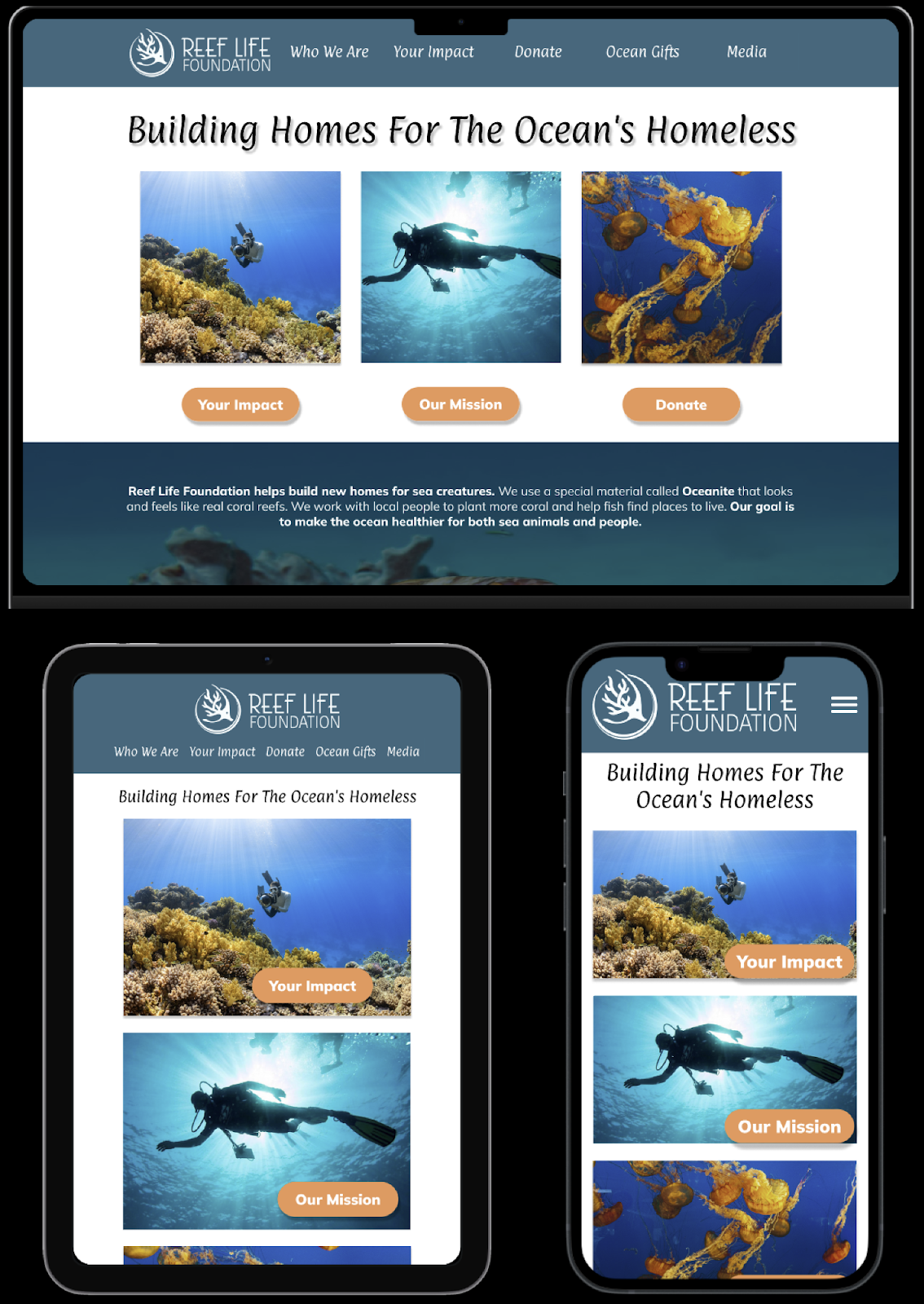
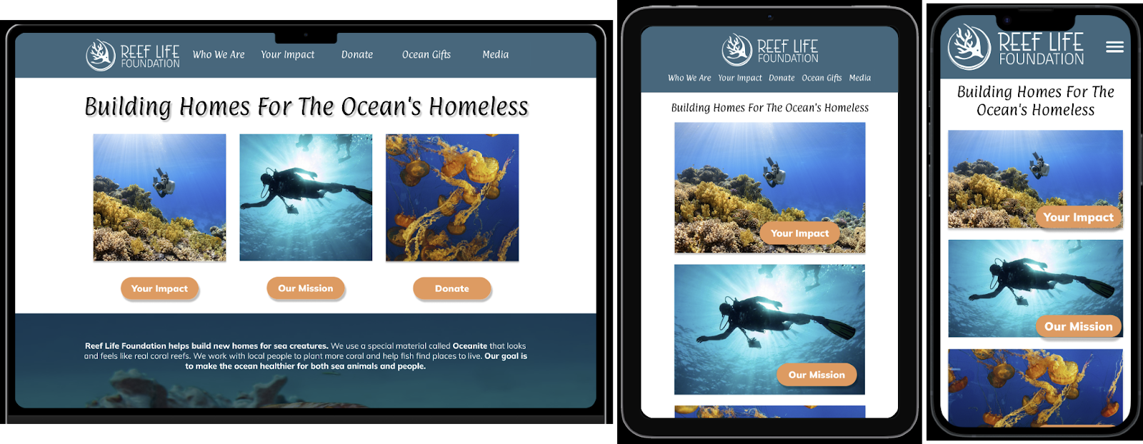
We made some mobile first wireframes and expanded to tablet and desktop. For the most part we kept the same layout but decluttered it and fixed some of the spacing issues.
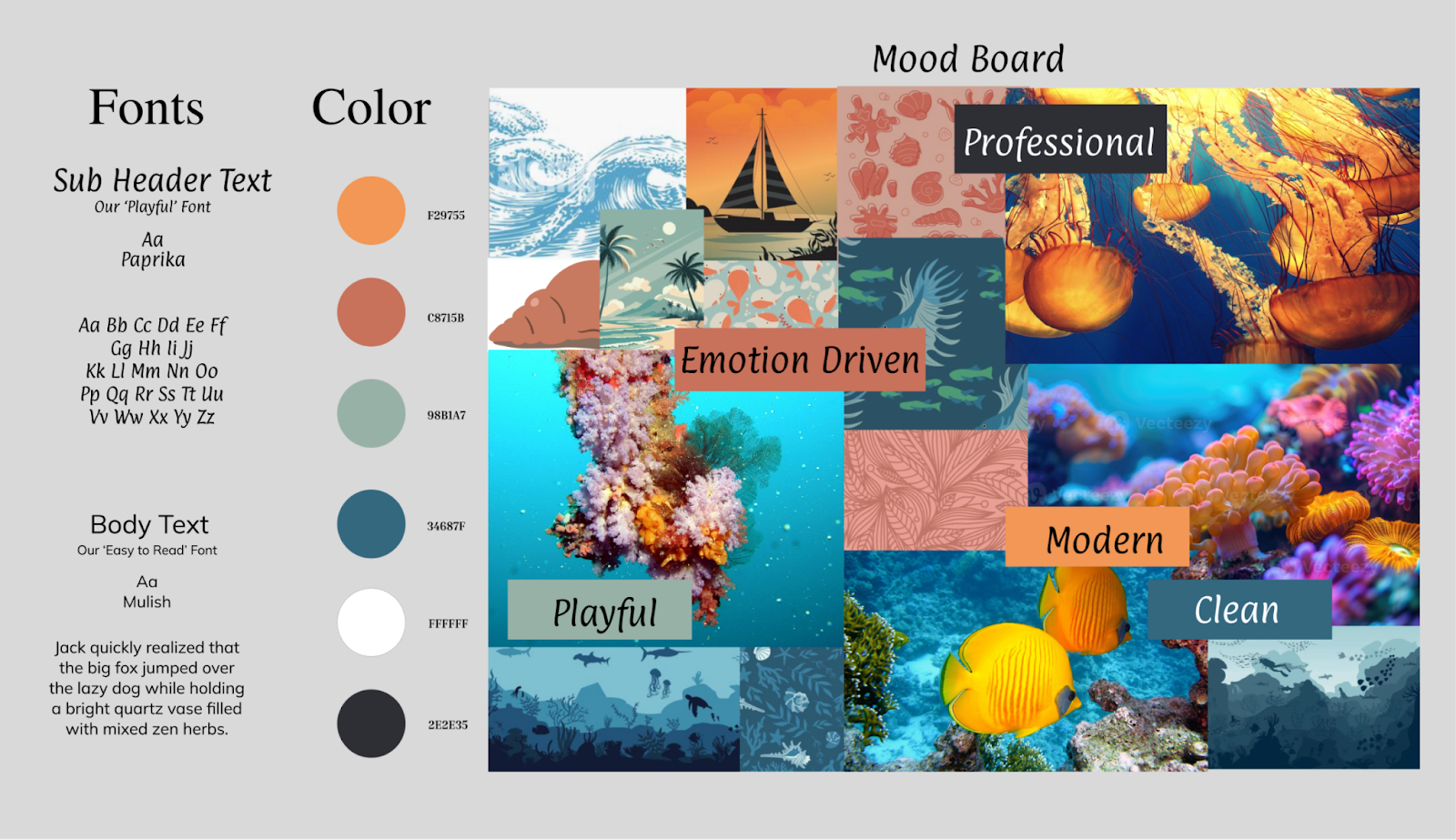
Style Sheet
High Fidelity
Front End Development
Overview
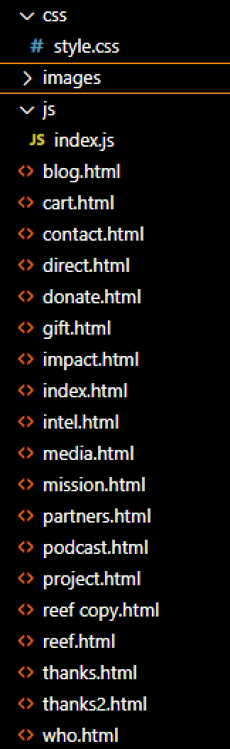
- File Set Up
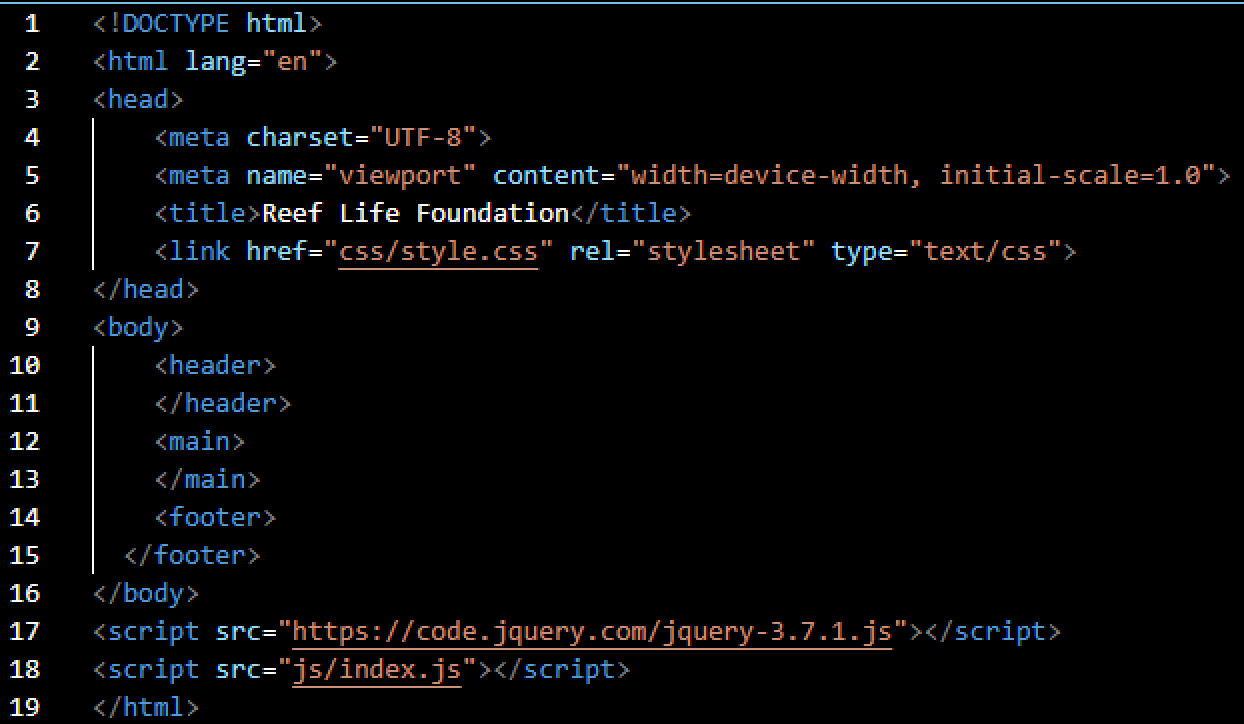
- HTML Set Up
- Navbar and Hamburger Menu
- Footer
- CSS Set Up
- JavaScript Set Up
Links
GitHub PrototypeFile Set Up
HTML Set Up
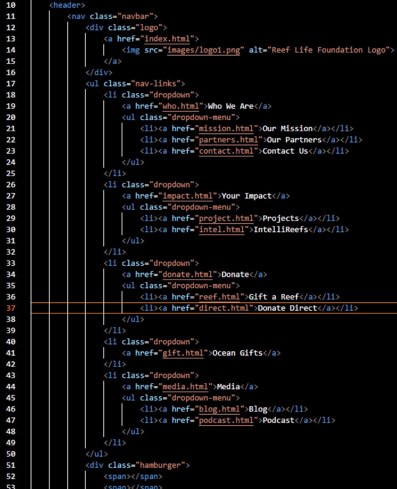
Navbar and Hamburger Menu
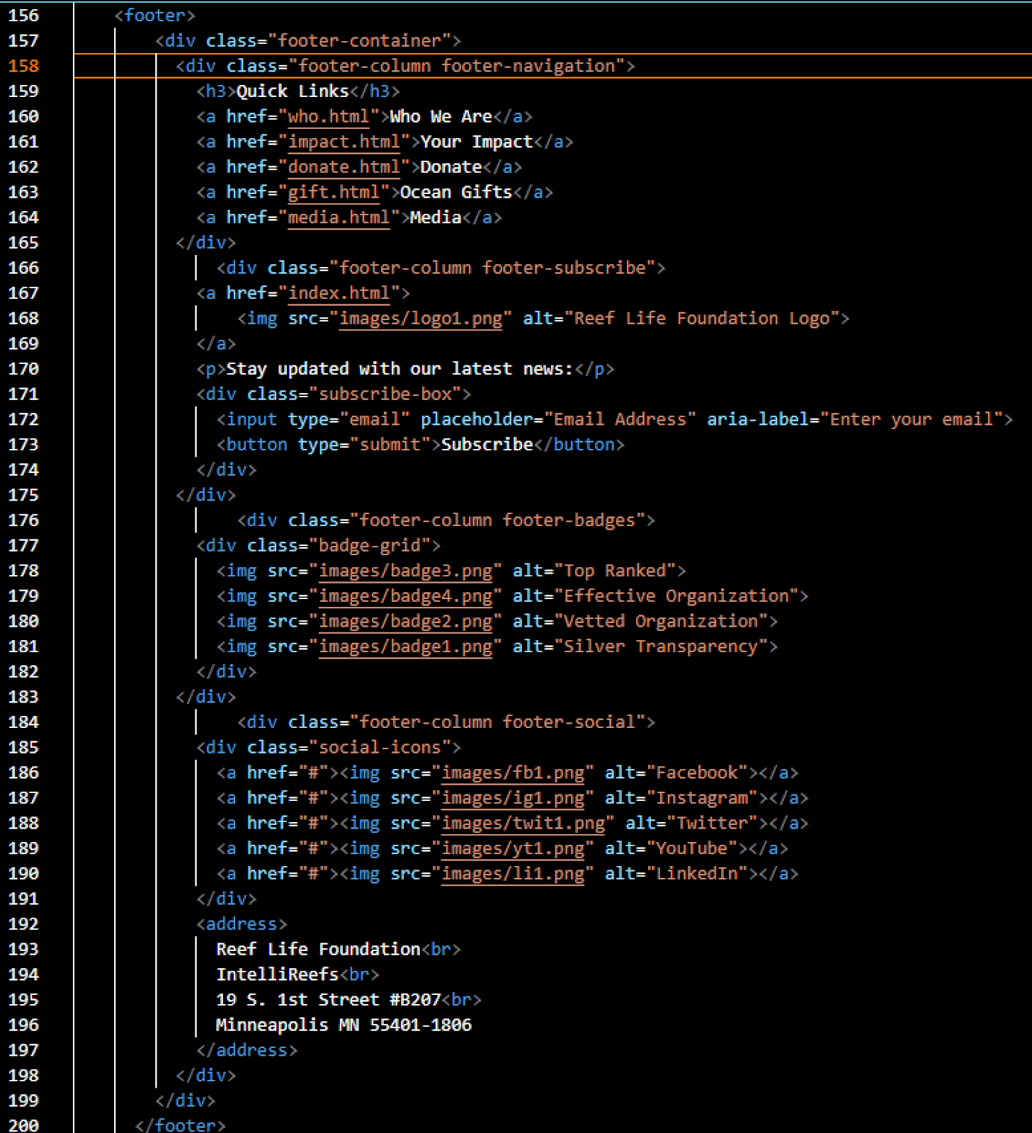
Footer
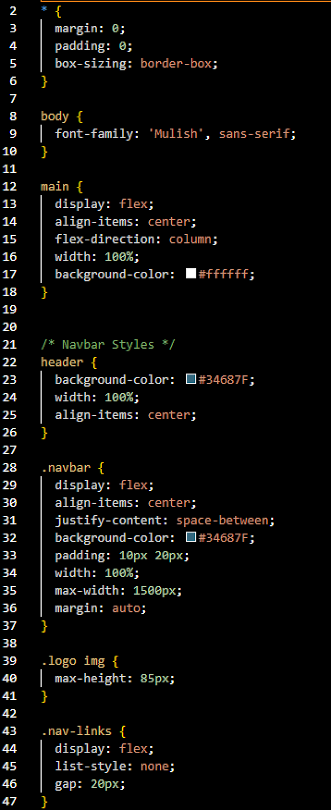
CSS Set Up
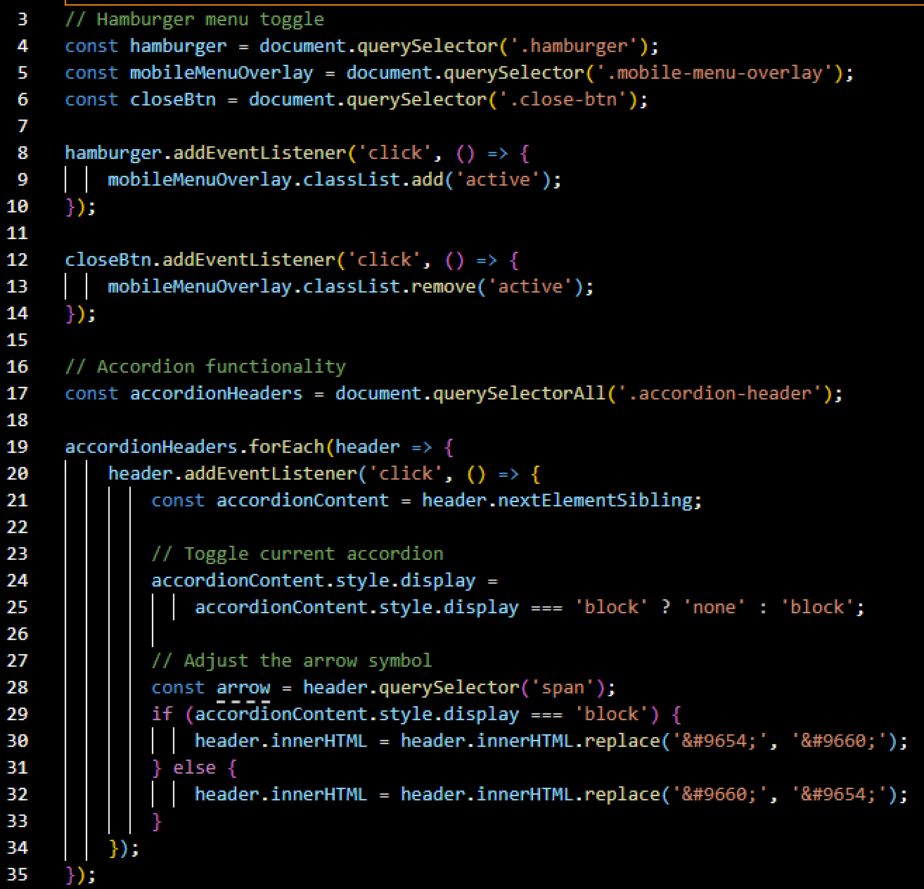
JavaScript
Feedback and Updates
Overview
- Approach and Goals
- What's Working
- Needs Improvements
- Actionable Recommendations
Links
User Test ResultsApproach
User Test with 5 particpants with 4 tasks.
Goals
We want to learn what steps will successfully get a user to donate and ultimately land on the thank you page or impact page after donating. Remember to record your usability test one way or another.
What's Working
1. Most users completed the tasks successfully with minimal redirection.
2. Navigation bars were often the go-to method for getting around the site.
3. Project and impact pages were generally easy to find once users looked in the right places.
4. Minimalist design and thank-you flow were praised.
5. Users liked multiple navigation options and found the top nav helpful.
Needs Improvements
1. Gift Shop = Donation Page Confusion The term “Gift Shop” didn’t clearly indicate it was for donations.
2. Project Page Placement Users looked under “Who We Are” for project info, not a separate section.
3. Donation Page Layout Alternating card layout unclear (esp. for 3 donation options).
4. Purchase Button Visibility Some buttons not immediately obvious or intuitive.
5. Overly Large Pages Caused users to miss content because scrolling wasn’t obvious.
6. Dropdown Menu Confusion Redundant nav or unclear labels.
7. No Quantity Option in Ocean Gifts Users wanted to select quantities before donating/purchasing.
8. Unclear Project-to-Donation Flow Suggested linking project pages directly to donation forms.
Actionable Recommendations
1. Clarify Donation Language & Pages.
2. Refine Navigation Structure.