Limitless Baseball
Overview
- Timeline: 2 weeks (80 hours)
- Role: Researcher, Designer, Developer
- Tools: Figma, VSCode, GitHub, ChatGPT
Background
Limitless Baseball is a small business owned and operated out of Clearfield, Utah. Their goal is to help kids learn the fundamentals of baseball and teach valuable lessons they can use on and off the diamond. Being in the baseball community in Utah his whole life, the owner, Breck Snyder, already had a few clients eager to sign up for lessons when they first opened their doors in May 2023. They needed to move fast so instead of getting a professional website done, Breck used Wix just to have something in place for his clients. So far Limitless Baseball has done really well, and received a lot of new business from referrals but now they want they want to create an image for themselves that oozes credibility and doesn’t rely on referrals alone for new business.
The Problem
Recently, Limitless Baseball has received feedback from parents who felt reluctant to sign their child up for lessons at the facility due to a cluttered website that in their words, “lacked credibility.” This makes it hard to attract new clients who might come across Limitless Baseball on Google rather than being referred. Parents want to know their kids are being left in good hands when they drop them off and Limitless Baseball’s current website doesn’t do a good enough job of sending that message. The saving grace so far has been that there’s not much competition in the area and the competition that is around also has fairly lack luster websites.
Limitless Baseball sees this as an opportunity to set themselves apart and be the leader in their community for sports training facilities.
Project Goals
Create a website that will leave an impression of credibility on parents so that they feel confident and comfortable in the decision to book a lesson for their child at Limitless Baseball.
Empathize
Research Approach
To best determine what will inspire our users (parents) to sign their kids up for lessons at Limitless Baseball, we will interview 5 past users. We want to determine how they felt when they first signed their kids up for lessons and what type of features would have increased their confidence. From there, we will take the criteria that we establish as important and evaluate some direct and indirect competitors. We want to see how/if they are implementing the important criteria on their sites and potentially find other ideas that will inspire us in our redesign.
Research Goals
1. Identify what makes a parent feel comfortable when they sign their kids up for sports training programs
2. Determine opportunities to set ourselves apart from the competition and be a leader in the community
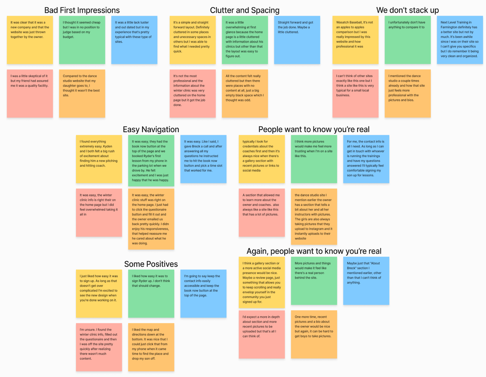
User Interviews Findings
After talking to users (parents), I learned a lot about how people find and experience Limitless Baseball’s website. Most users came across it through word-of-mouth or online searches, but their first impressions pointed out issues with the design feeling outdated and cluttered. A lot of feedback focused on adding things to build trust, like coach bios, social media links, and a clearer layout. Based on this, I’m recommending a redesign to make the site look more modern, easier to navigate, and more trustworthy overall.
First Impressions
1. Design Perception: The website was often perceived as cluttered and outdated, with some users describing it as "thrown together" or "cheap."
2. Skepticism: Due to the design, a few users felt initial skepticism about the site's professionalism and credibility.
Layout and Navigation
1. Clarity: While the layout was deemed straightforward by some, others found it overwhelming due to cluttered information, especially on the homepage.
2. Content Gaps: Users noted inconsistencies, such as large empty spaces juxtaposed with densely packed sections.
Trust and Credibility
1. Mixed Feelings: Trust in the website varied. Some users relied on external recommendations to validate the site's credibility, while others felt the design diminished trust.
2. Contact Information: The availability of contact details and directions was appreciated and helped alleviate some concerns.
Desired Features
1. Coach Credentials: Users expressed interest in seeing detailed information about coaches' qualifications and backgrounds.
2. Active Social Presence: Links to active social media accounts or a gallery with recent photos were suggested to enhance authenticity and engagement.
Competitive Analysis
User interviews helped determine the criteria that’s most important to our users while evaluating direct and indirect competitors.
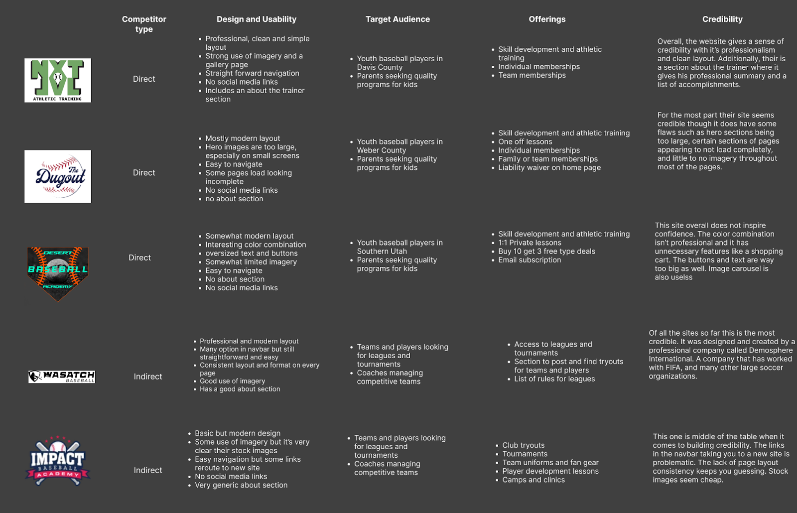
Opportunities for Differentiation
- Add more imagery from the Limitless Baseball facility and possibly a gallery section. Few competitors are using images well.
- Include a comprehensive “About” section to introduce the business and staff, building trust.
- Embed social media links or feeds to show updates and enhance credibility.
- Allow parents to digitally sign liability waivers via DocuSign or a similar tool.
Define
Overview
- Affinity Map
- User Persona
- Insight Statement
- Problem Statement
Affinity Map
Our user interviews helped us find 6 themes to keep in mind as we move forward.
User Persona
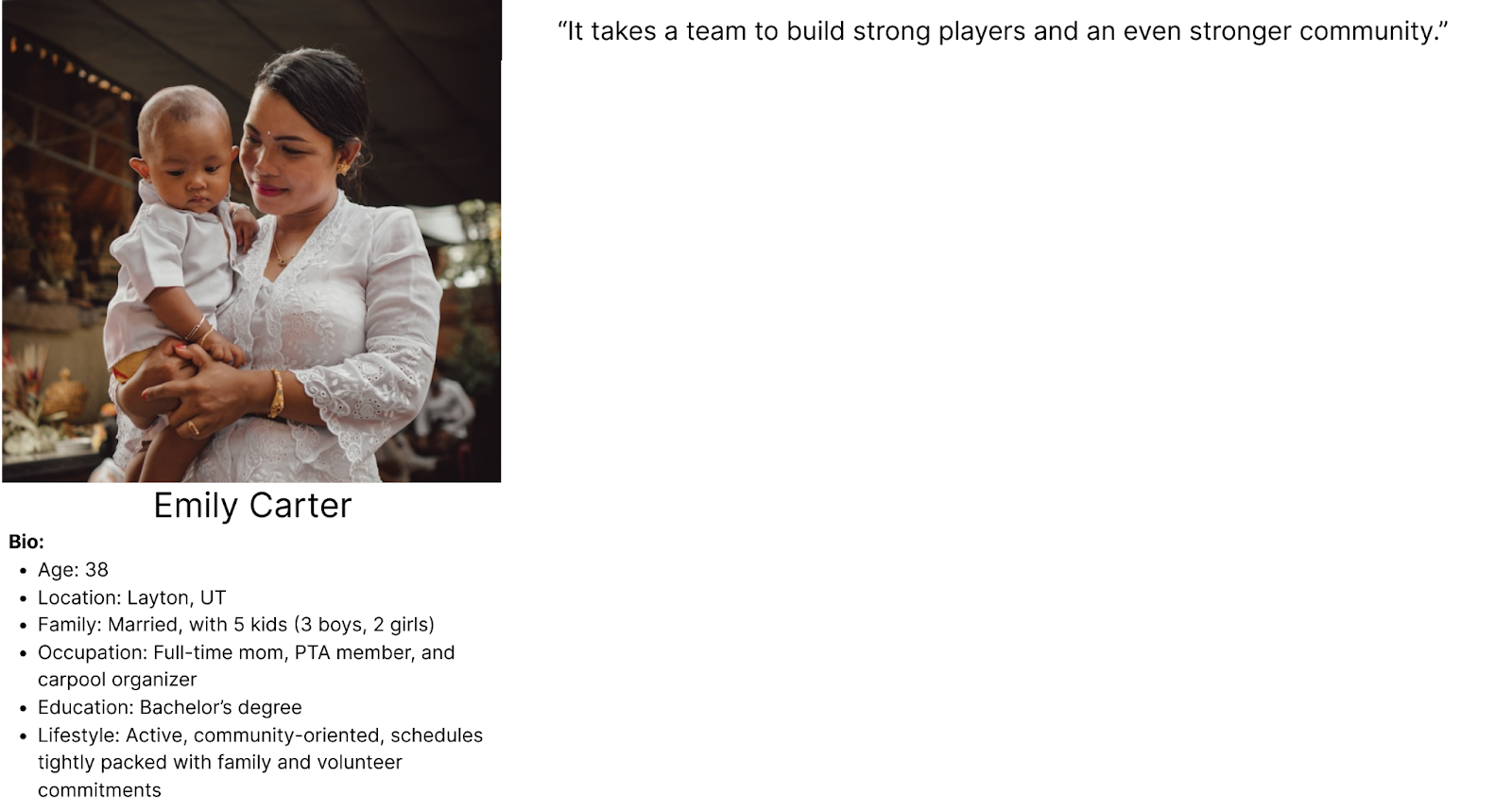
User Insight Statement
Emily Carter, a community-focused and organized mom of five, seeks credible, professional baseball programs that foster skill development, safety, and community engagement for her children. Her busy schedule makes her prioritize programs that provide clear, accessible information and streamline decision-making.
Problem Statement
Emily Carter needs a way to easily find and evaluate trustworthy baseball clinics for her boys because the current website is cluttered, lacks professionalism, and does not clearly present essential information such as coach credentials, and community involvement, which undermines her confidence in the program.
Ideate
Overview
- How Might We...
- Prioritization Matrix
- User Flow
- Site Map
How Might We
...redesign the website to present a more professional and polished appearance that instills trust in users like Emily?
...organize the website in a way that reduces clutter and allows users to navigate effortlessly?
...showcase the program’s active involvement in the community through recent photos, testimonials, and a social media presence?
...feature coach bios and credentials to build confidence in the program’s quality and expertise?
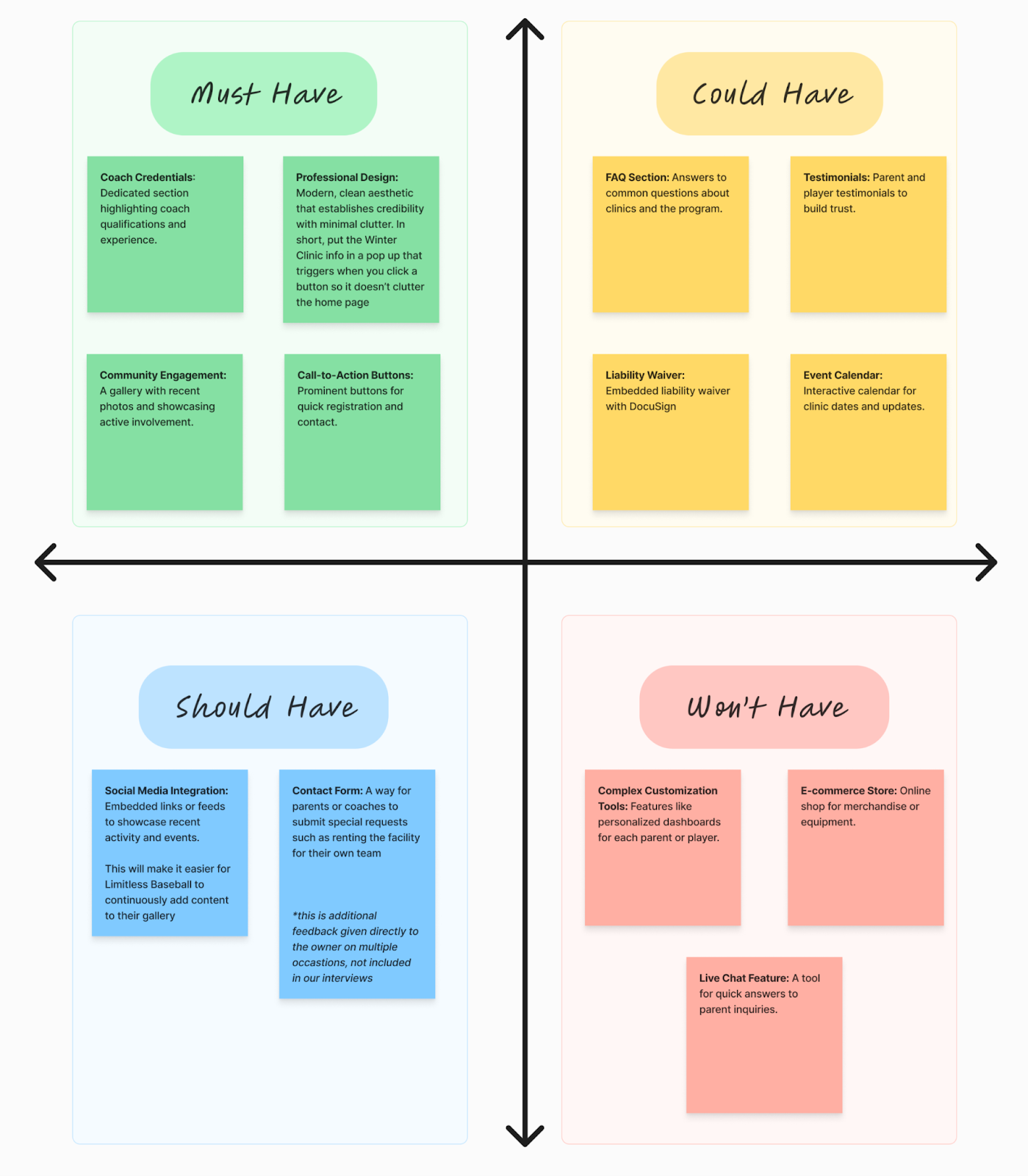
Prioritization Matrix
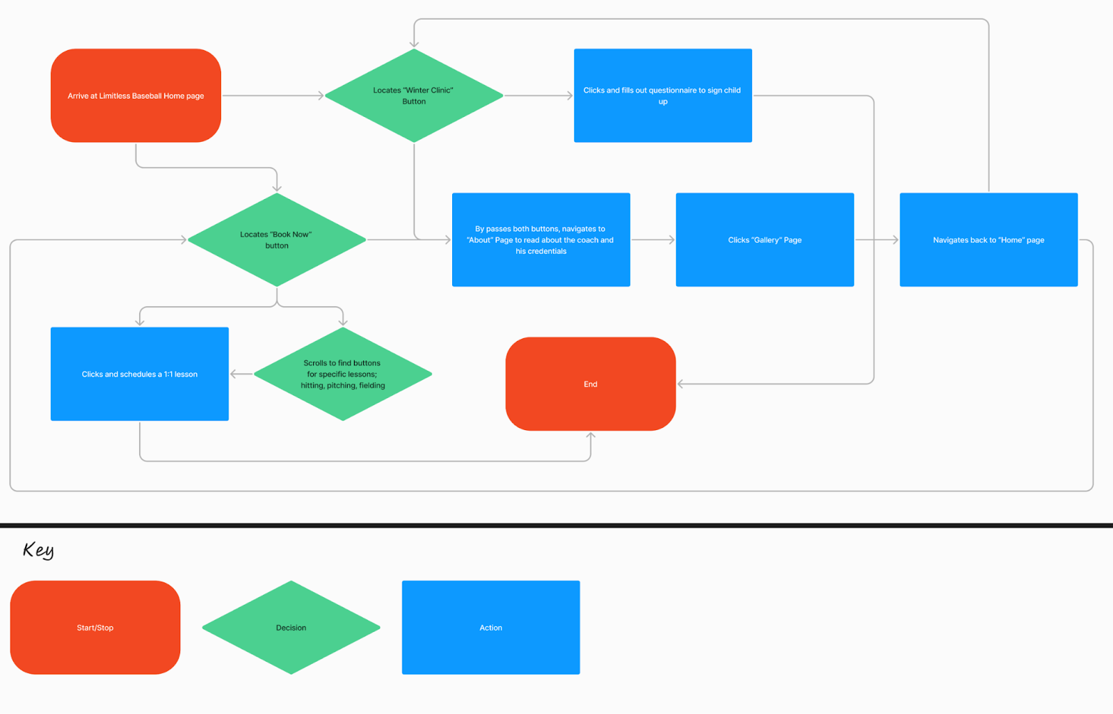
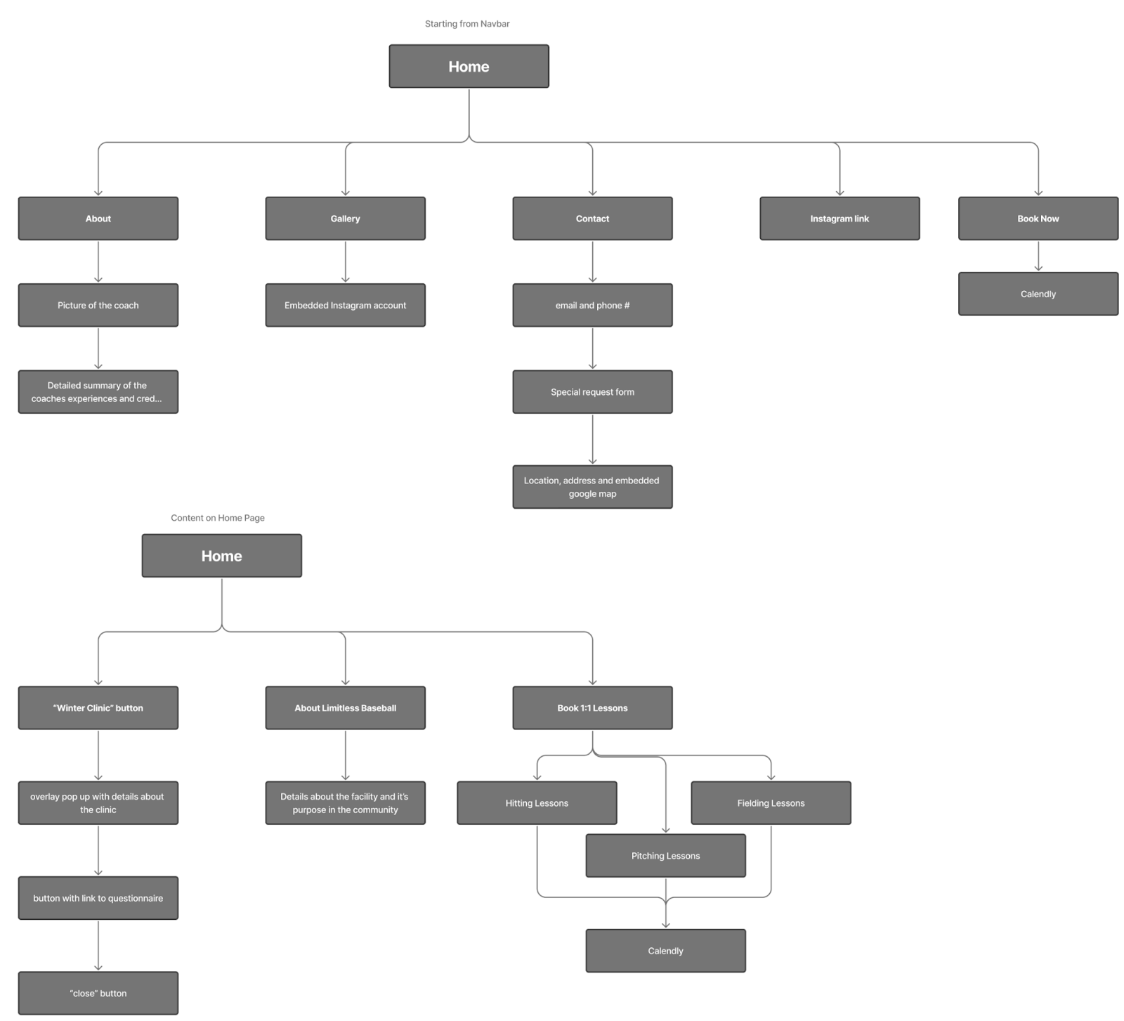
User Flow
Site Map
Wireframes and Protoypes
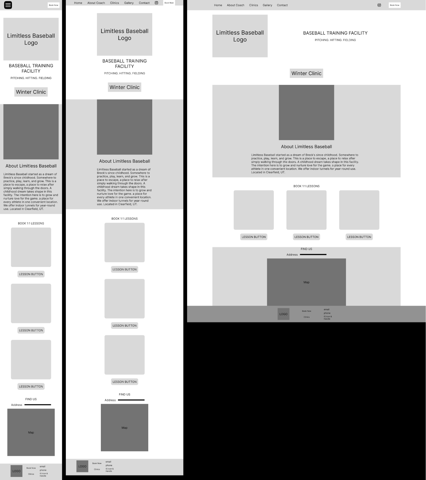
Low Fidelity
We made some mobile first wireframes and expanded to tablet and desktop. For the most part we kept the same layout but decluttered it and fixed some of the spacing issues.
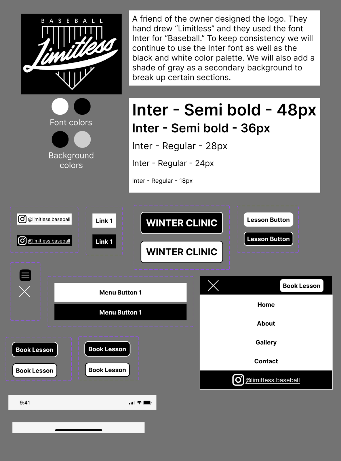
Style Sheet
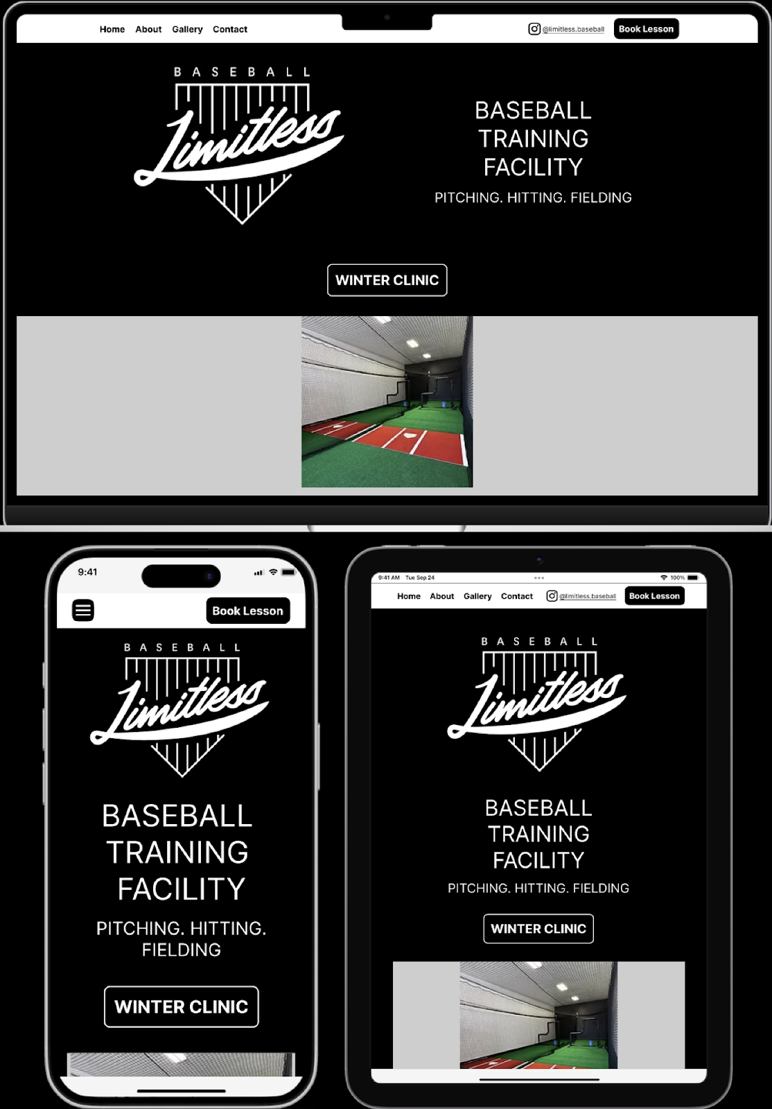
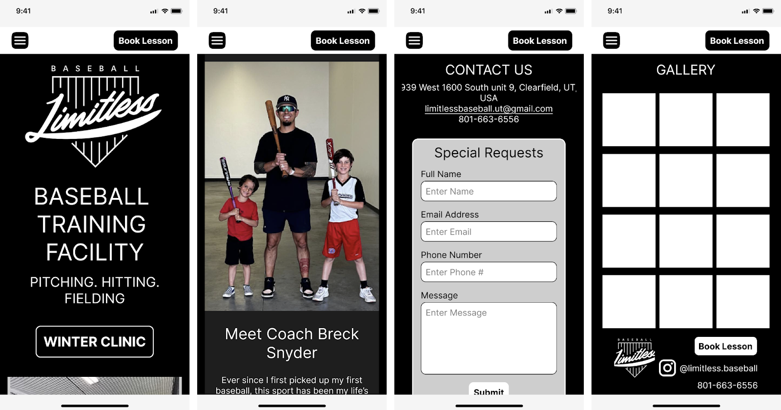
Mobile - High Fidelity
Tablet - High Fidelity
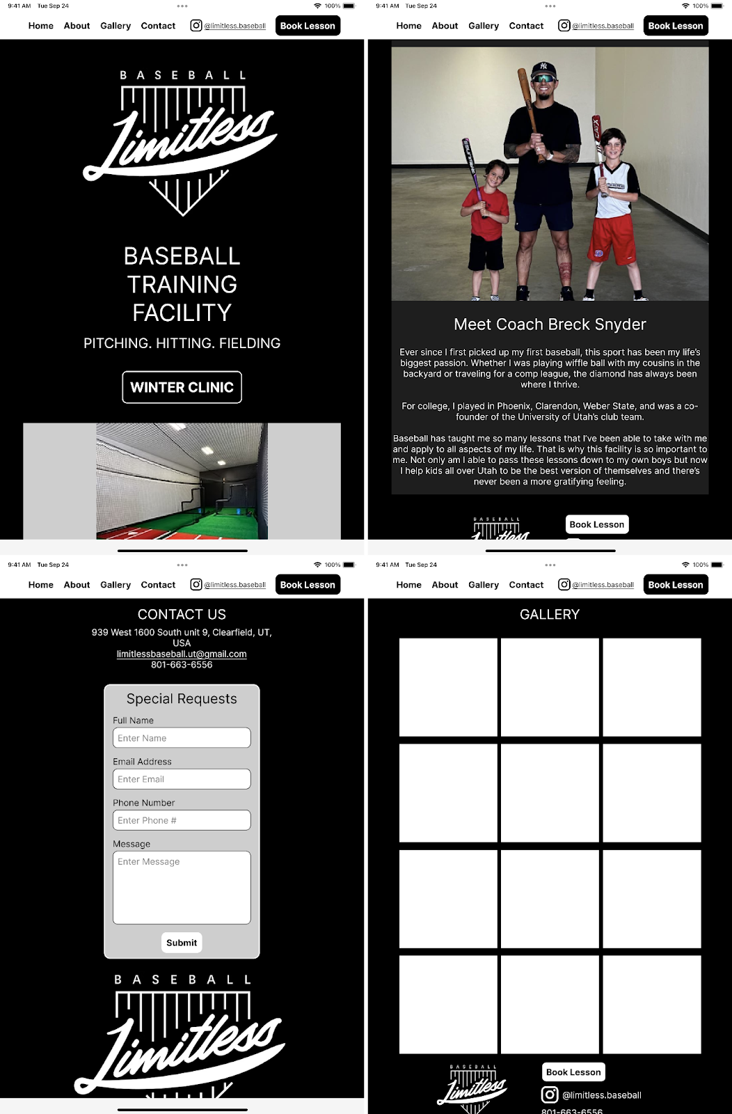
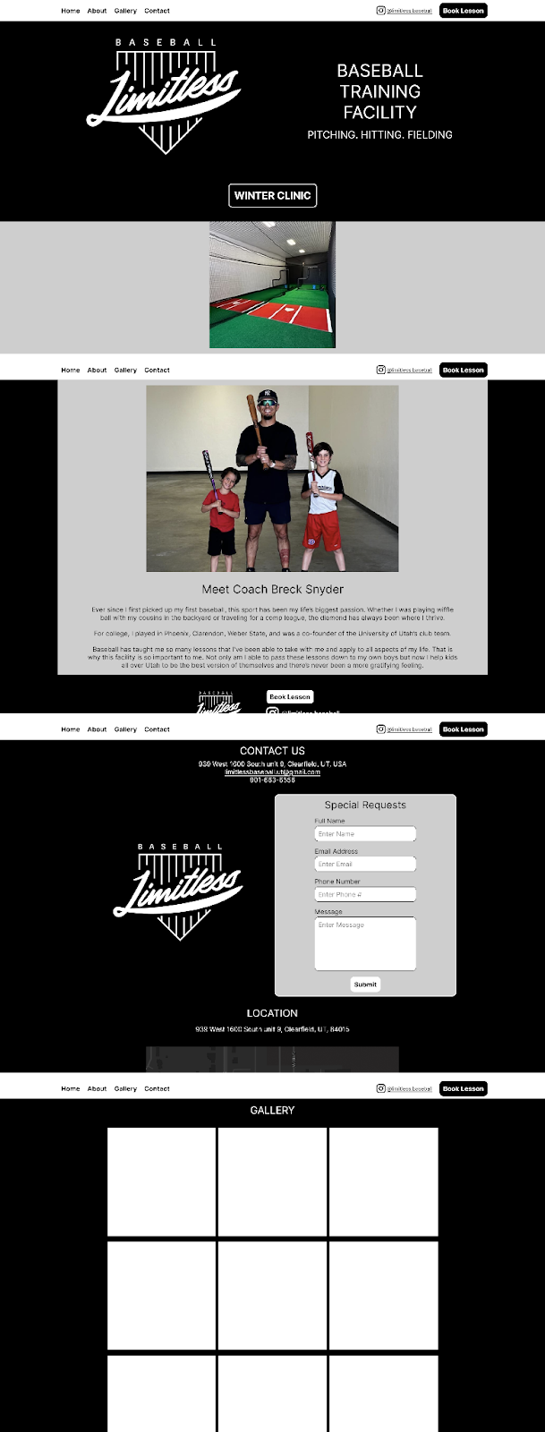
Desktop - High Fidelity
Front End Development
Overview
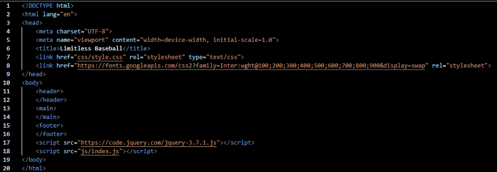
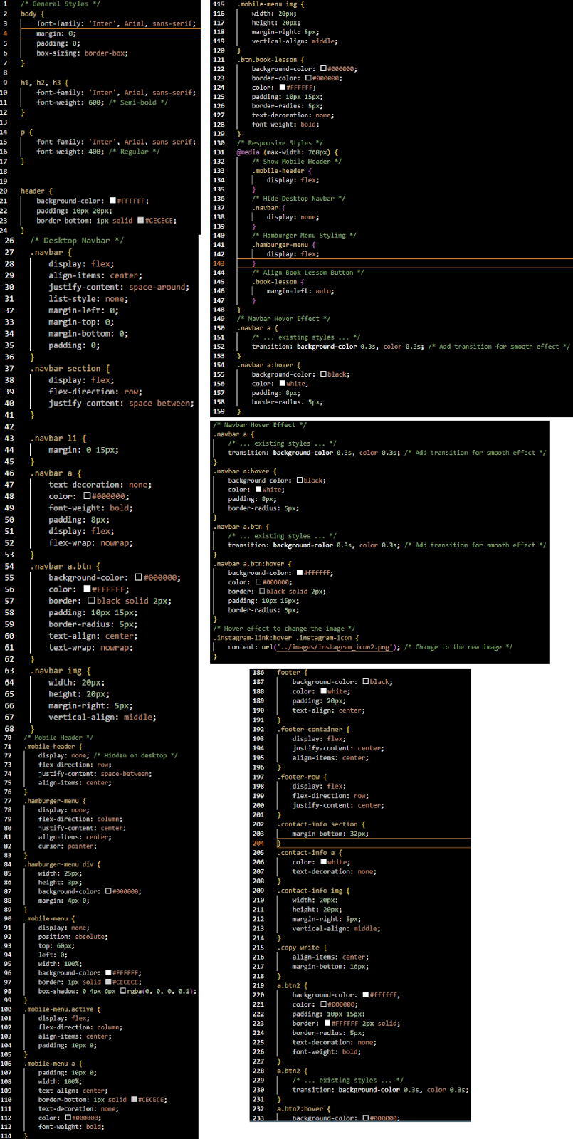
- HTML Set Up
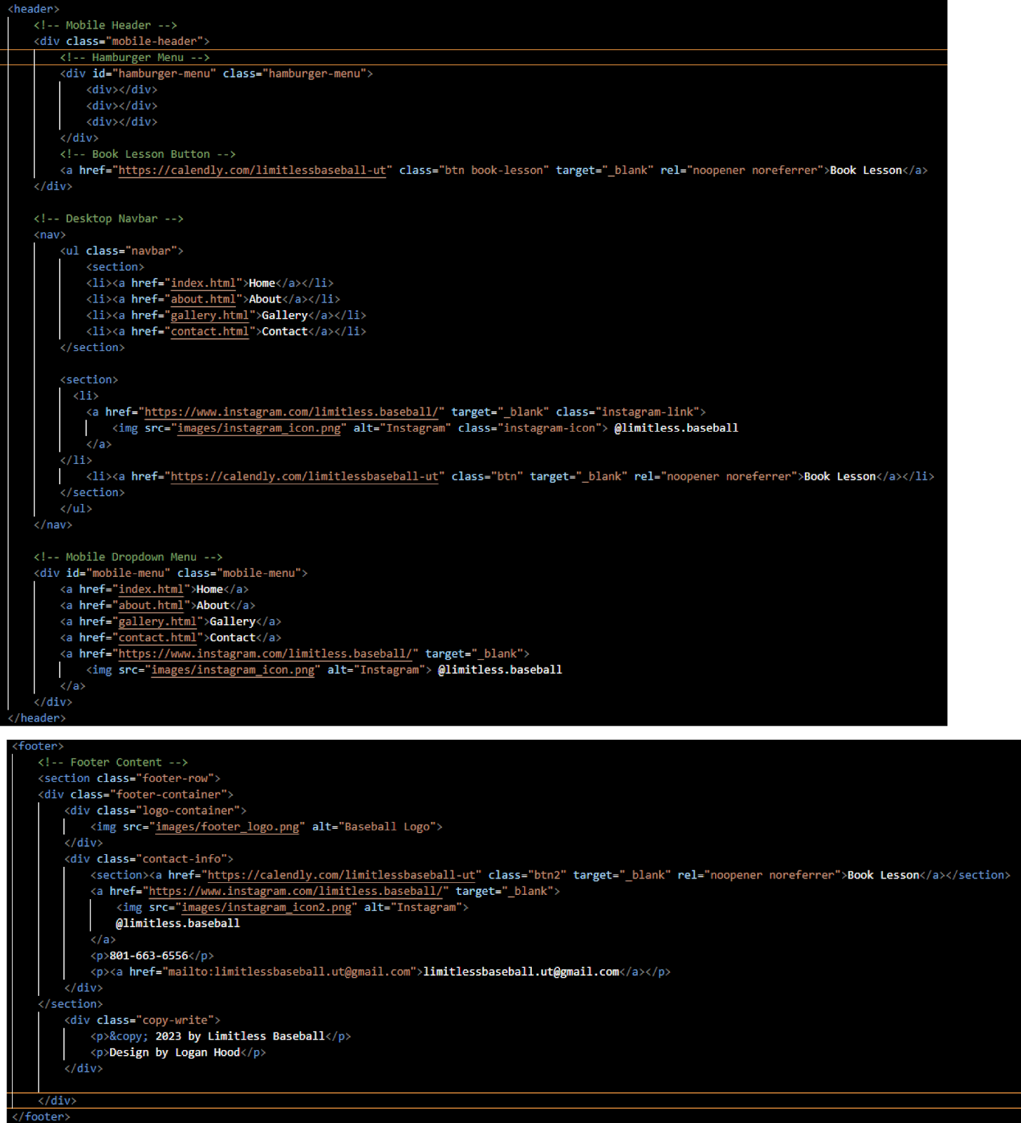
- Header & Footer Set Up
- CSS Mobile First Set Up
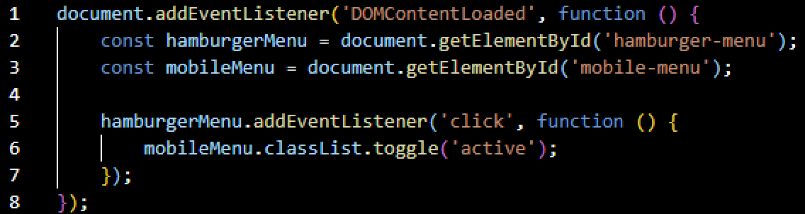
- JavaScript Set Up
Links
Live SiteHTML Set Up
Header & Footer Set Up
CSS Mobile First Set Up
JavaScript Set Up
Feedback and Updates
Approach
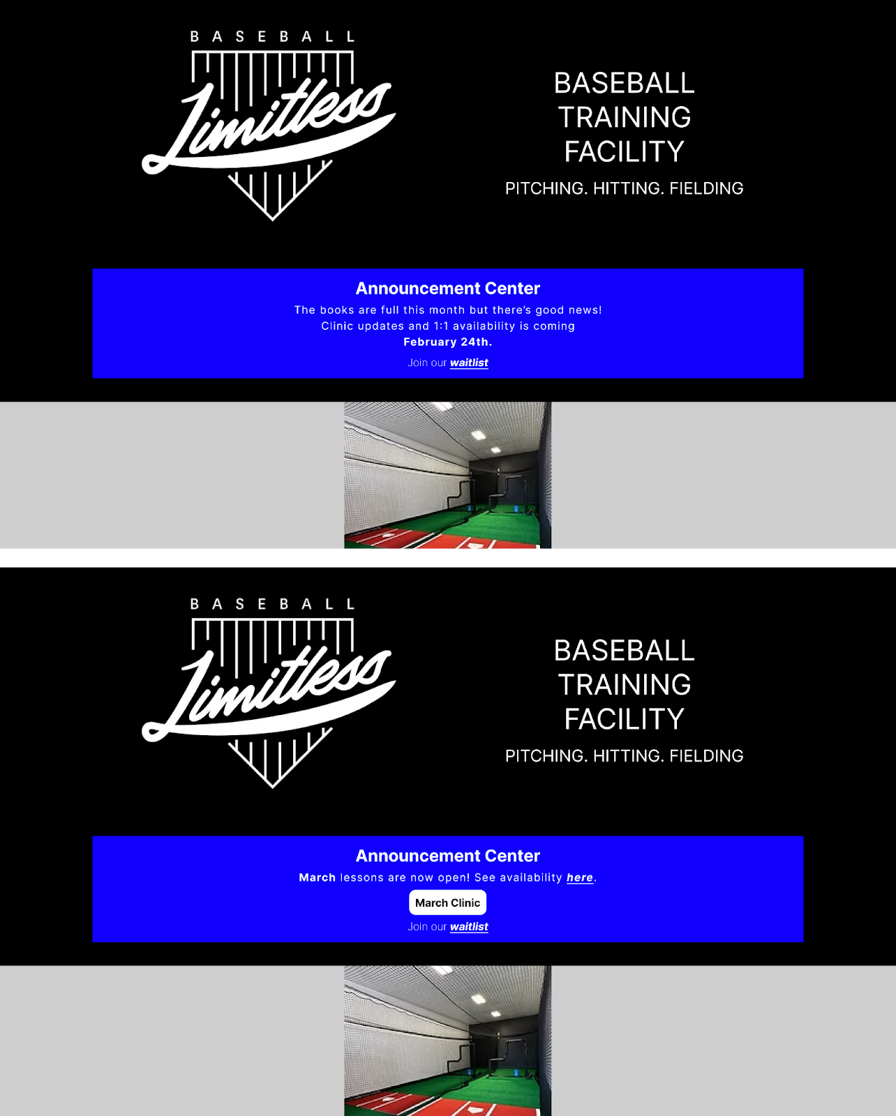
If you clicked the “Live Site” button, you probably noticed we added an Announcement Center section that wasn’t included in the initial prototype. This addition came after the client, Breck, chose to forgo traditional user testing and instead rely on direct feedback from his clients, leveraging the strong relationships he has built with them. After two months of conversations and allowing users time to settle into the new site, we identified three key pieces of feedback that guided meaningful improvements.
User Feedback
1. Lessons get booked up too fast for clinics and one on ones.
2. There's no indication of when the calendar will be open for 1:1 sessions and new clinics announcements.
3. It’s confusing that the clinic button is available even when there are no clinics scheduled.
Proposed Updates
1. Add a waitlist for when the books are full that starts over monthly. Those on the waitlist will be called when cancelations occur.
2. Add an announcment center that will update users on when their will be availability for clinics and 1:1 sessions.
3. Remove the button leading to the clinic sign up sheet when there are no clinic scheduled.
Updated Home Page
It was very easy to address all of these user issues by simply adding an Announcement Center that addressed all 3 pieces of feedback.